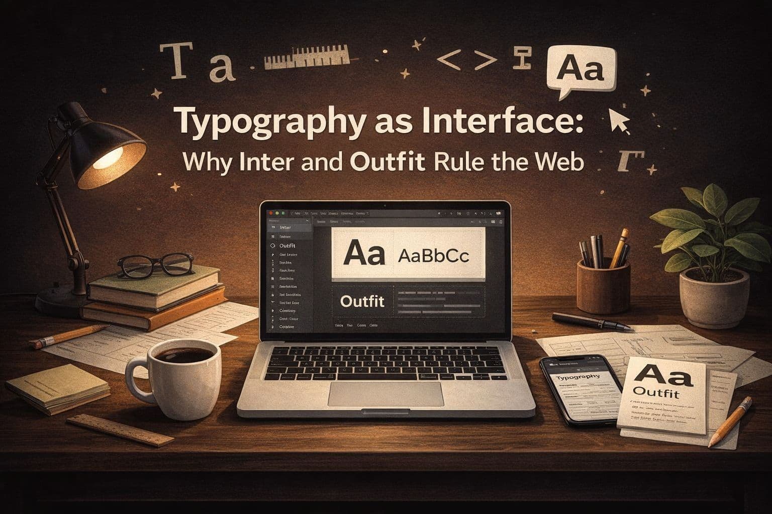
Typography as Interface: Why Inter and Outfit Rule the Web
Why I chose Inter and Outfit for my portfolio and Rune AI. A deep dive into font functionality, readability at scale, and how typography defines digital product identity.
Typography is 90% of the web. It's not just about what you say, but how it looks when you say it.
When building this portfolio and Rune AI, I didn't just pick fonts that "looked nice." I treated typography as core UI infrastructure. The right font choice handles density, scales across devices, and subconsciously communicates the brand's personality before a user reads a single word.
Here is why Inter and Outfit are the power couple of the modern web, and how I use them.
The Workhorse: Inter
I use Inter for the body execution, dashboards, and dense information layers in Rune AI.
Why Inter?
It was capable of displaying dense data without causing eye fatigue.
Inter was designed specifically for computer screens. It features a tall x-height, which makes lowercase letters easier to distinguish at small sizes.
| Feature | Design Impact |
|---|---|
| Tall X-Height | Increases readability on mobile screens and small badges. |
| Tabular Numbers | Crucial for data tables, pricing tiers, and dashboards where numbers must align vertically. |
| Disambiguation | Distinguishes between similar characters like 'I', 'l', and '1'—essential for code blocks and technical content. |
In Rune's chat interface, readability is paramount. Users are parsing AI-generated text rapidly. Inter disappears into the background, letting the content take center stage.
The Personality: Outfit
While Inter handles the logic, Outfit brings the soul. I use Outfit for headings, brand moments, and the primary navigation of this portfolio.
Outfit is a geometric sans-serif, similar to classics like Futura, but with modern, humanistic touches. It feels "tech" but not "robotic."
Where I Use Outfit
- Main Headings (H1-H3): Its geometric shapes create a strong visual hierarchy.
- Navigation Links: The rounded characters feel friendly and clickable.
- Lab Cards: It pairs perfectly with the futuristic, experimental vibe of the Galaxy and Antigravity labs.
The Pairing Strategy
Great design relies on contrast. You need a reliable "Straight Man" (Inter) to let the "Star" (Outfit) shine.
/* My Typography System */

/* The Star */
.font-display {
  font-family: 'Outfit', sans-serif;
  letter-spacing: -0.02em; /* Tighter tracking for headlines */
}

/* The Workhorse */
.font-body {
  font-family: 'Inter', sans-serif;
  line-height: 1.6; /* Generous breathing room for reading */
}
Typography SEO checklist
Using web fonts contributes to your Core Web Vitals. Here is how I optimized them for this site:
Self-Hosting (Next.js Fonts)
I use next/font to automatically self-host Google Fonts. This prevents layout shifts (CLS) and eliminates extra network handshakes to Google's servers.
Variable Fonts
Instead of loading Regular, Medium, and Bold as separate files, I use a single Variable Font file. One request, infinite weights.
Subsetting
I only load the "Latin" subset, stripping out thousands of unused glyphs to keep the file size tiny.
Conclusion
Fonts are the clothing of your words. Inter is the tailored suit—professional, functional, and fits anywhere. Outfit is the statement accessory—bold, memorable, and distinct.
Together, they create an interface that is easy to read but impossible to forget.

Author Parth Sharma
Full-Stack Developer, Freelancer, & Founder. Obsessed with crafting pixel-perfect, high-performance web experiences that feel alive.
Designing Fluid Interfaces: My Approach to Animation
Next Article →Hands-On with Claude Opus 4.6 vs Gemini 3 Pro vs GPT-5.2
Discussion2
Join the conversation
Sign in to leave a comment, like, or reply.
🔥🔥
Grateful insight