Why 90% of Developer Portfolios Look the Same (And How to Actually Stand Out)
Dark mode, a hero section with a wave emoji, a grid of project cards. Sound familiar? Here is why most developer portfolios blend together and what to do about it.
Dark mode, a hero section with a wave emoji, a grid of project cards. Sound familiar? Here is why most developer portfolios blend together and what to do about it.
I spend a lot of time looking at developer portfolios. Reviewing them for peers, studying them for design inspiration, and occasionally auditing them for clients. And the overwhelming pattern is this: they all look the same.
Not just similar. The same. Same layout. Same sections. Same color palette. Same animations. Same "Hi, I am [Name], a passionate developer" opening. It is like there is a secret template that 90% of developers use, and nobody is willing to deviate from it.
Let me be clear: there is nothing wrong with a clean, functional portfolio. But if your goal is to stand out, to be memorable, to make a recruiter or potential client think "this person is different," then following the default template is working against you.
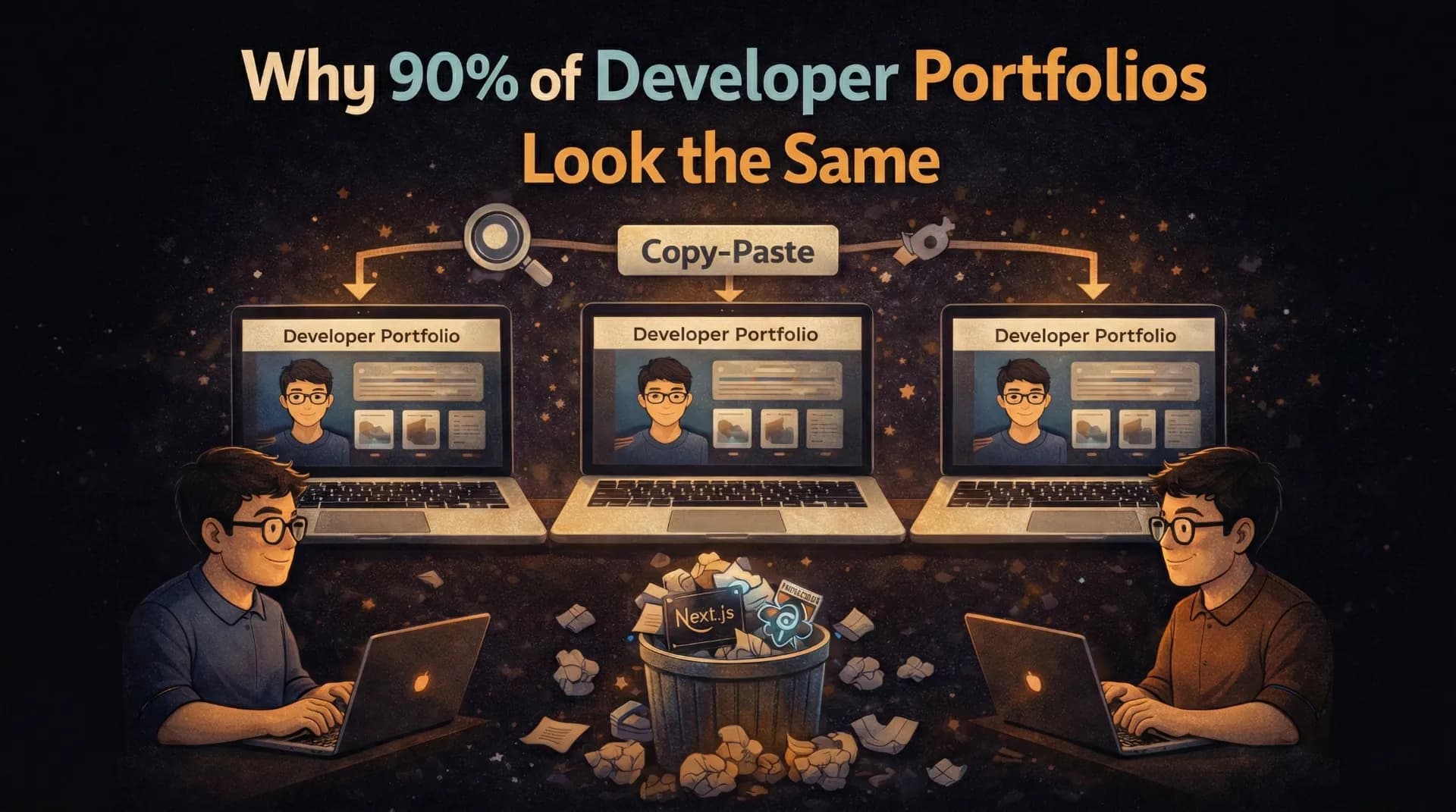
The Default Developer Portfolio Template
You know exactly what I am talking about:
- Dark mode (always dark mode)
- Hero section with "Hi, I am [Name] 👋" and a brief tagline
- About section with a photo and a paragraph about being "passionate about building things"
- Skills section with a grid of technology logos/icons
- Projects section with 3-6 cards showing title, description, and GitHub/live links
- Contact section with a form or social links
- Footer with "Built with Next.js and Tailwind CSS"
Am I close? I bet I described at least 80% of the developer portfolios you have seen. Maybe even yours.
Because developers (myself included) learn by copying. We watch a YouTube tutorial titled "Build a Developer Portfolio with Next.js," follow it step by step, customize the colors and content, and call it done. The result is a sea of near-identical sites.
Why Sameness is a Problem
When a hiring manager reviews 50 portfolios in an afternoon, the ones that look like every other portfolio get forgotten immediately. Your portfolio is supposed to be evidence that you can build unique, thoughtful web experiences. If your portfolio itself is generic, what message does that send?
Think about it from the other side:
"I reviewed 50 developer portfolios this week. 45 of them had the same dark theme, the same project cards layout, and the same 'built with Next.js and Tailwind' footer. The 5 that stuck with me did something I had not seen before."
That is a direct quote from a CTO I spoke with at a Bangalore meetup. The developers who got callbacks were not necessarily the most technically skilled. They were the most memorable.
What Makes a Portfolio Memorable
After studying hundreds of developer portfolios (and building sites for clients), I have identified the specific elements that make a portfolio stand out:
1. A Strong Point of View
The biggest differentiator is not a fancy animation or a unique layout. It is having something to say.
Most portfolios present information: "Here are my skills. Here are my projects. Here is how to contact me." They are essentially interactive resumes. And that is fine, but it is forgettable.
The portfolios that stick with me take a position:
- A developer who organized their entire portfolio around design systems, showing how they think about component architecture
- A developer whose portfolio was a single long-form case study of their best project, with no generic sections at all
- A developer who built their portfolio as an interactive terminal, where you type commands to navigate
Your portfolio should reveal how you think, not just what you have done. Anyone can list technologies. Showing your thought process is what makes you irreplaceable.
2. Genuine Interaction Design
I do not mean "add more animations." I mean thoughtful interactions that serve a purpose.
Most animations on developer portfolios are gratuitous. Elements fade in on scroll. Cards have hover effects. The navbar has a blur backdrop. These are all fine and expected, but none of them make you memorable.
Interactions that do make you memorable:
- A command menu (Cmd+K) that lets visitors navigate your site like a power user
- Interactive code playgrounds embedded in your blog posts so readers can experiment
- Micro-interactions that reward exploration (easter eggs, hidden pages, subtle details)
- A guestbook where visitors can leave messages, adding a human, community element
- Live data like currently playing music, recent GitHub activity, or real-time visitor count
These interactions show that you care about user experience, not just aesthetics.
3. Content Depth
A project card with a title, one-line description, and a GitHub link tells me almost nothing. What I want to see:
- Why you built it (the problem you were solving)
- How you built it (the interesting technical decisions)
- What you learned (the challenges and trade-offs)
- The result (metrics, user feedback, outcomes)
This is where case studies and blog posts become your secret weapon. A developer with 3 projects and detailed case studies for each is infinitely more interesting than a developer with 10 projects and no explanation beyond a README.
Choose Your Best 2-3 Projects
Quality over quantity. Pick the projects that best demonstrate your range and depth. A real-time app, a design-heavy site, and a tool that solves a real problem show more breadth than 8 CRUD apps.
Write a Detailed Case Study for Each
Cover the problem, your approach, the technical stack, specific challenges, how you solved them, and the outcome. Include screenshots, architecture diagrams, and code snippets. This is your chance to show how you think.
Include Real Metrics
"50 active users." "Cut API response time from 2s to 200ms." "Processed 10,000 transactions in the first month." Numbers make projects real and memorable.
Add Blog Posts About the Process
A blog post about "How I reduced our bundle size by 60%" or "Why I chose Supabase over Firebase for this project" demonstrates ongoing learning and communication skills, both of which are highly valued.
4. Personality and Authenticity
The safest portfolio is the most boring one. Developers are afraid to show personality because they think it will seem "unprofessional." But personality is exactly what makes you human and memorable.
Ways to inject personality without being unprofessional:
- A unique writing voice in your blog and project descriptions
- An About page that goes beyond "I am a full-stack developer" and reveals your interests, motivations, and quirks
- Design choices that reflect you, not just the current trend (maybe you love brutalist design, or retro aesthetics, or maximalism)
- Honest reflections about failures and learning moments, not just highlights
I have seen portfolios that feel like they were generated by AI because every sentence is this polished, generic corporate speak. "I am passionate about crafting elegant solutions to complex problems." That sentence means nothing. It could be on literally anyone's portfolio.
Instead: "I spent 3 weeks debugging a WebSocket reconnection issue on a client's dashboard. It turned out to be a race condition in our heartbeat mechanism. Here is what I learned about building reliable real-time systems." That is memorable.
The Anti-Patterns to Avoid
Just as important as what to do is what not to do:
Over-Engineering for Showoff Value
Three.js particle backgrounds, WebGL shaders, cinematic scroll animations... these are impressive technically but often make the site:
- Slow to load (especially on mobile)
- Distracting from the actual content
- Inaccessible to users with motion sensitivity
- A signal that you prioritize flashiness over usability
If your portfolio takes more than 2 seconds to load because of animations, you are not showing off your skills. You are showing that you do not understand web performance.
The "Everything I Have Ever Done" Portfolio
Listing every project, every technology, every course, every everything dilutes your message. It is like a resume that is 5 pages long. More is not better.
Curate ruthlessly. Show your best 3-5 projects. List your strongest 6-8 technologies. Write about the topics you genuinely care about. Less noise means more signal.
Copying a Famous Developer's Portfolio
Every year, a few developer portfolios go viral on Twitter. Within weeks, dozens of near-identical copies appear. This is the worst thing you can do for standing out.
By all means, take inspiration from portfolios you admire. But copying the layout, the animations, and the structure (just swapping in your own content) is immediately recognizable and signals the opposite of creativity.
A Practical Framework for Differentiation
If you are building or rebuilding your portfolio in 2026, here is my suggested approach:
Step 1: Define Your Narrative
Before you write a single line of code, answer: What is the one thing I want visitors to remember about me?
Not "I am a full-stack developer." That is a category, not a narrative.
Maybe: "I build products that solve real problems for small businesses." Or: "I obsess over performance and can make any web app fast." Or: "I bridge the gap between design and engineering."
Your narrative should guide every decision, from layout to content to interactions.
Step 2: Choose a Structure That Serves Your Narrative
If your narrative is about product thinking, maybe your portfolio shows detailed product case studies instead of generic project cards.
If your narrative is about performance, maybe your portfolio is absurdly fast (sub-500ms load time) and you explain exactly how you achieved it.
If your narrative is about creativity, maybe your navigation is unconventional or your visual design breaks expectations.
Step 3: Add One Surprise
Every memorable portfolio I have seen has at least one element that makes you go "oh, that is cool." It does not have to be technically complex. It just has to be unexpected.
Ideas:
- A hidden page accessible through the command menu
- A custom 404 page that is genuinely funny or useful
- An interactive element that responds to the visitor's behavior
- An "achievements" section styled like a video game
- A "currently" section showing real-time data about what you are working on, listening to, or reading
Step 4: Write More Than You Design
This is counterintuitive for a visual medium, but: the most impactful portfolios are content-heavy, not design-heavy. Blog posts, case studies, and thoughtful project descriptions create more value than any animation ever will.
A beautifully designed portfolio with no content tells me you can make things look pretty. A content-rich portfolio tells me you can think, communicate, and build. The latter is infinitely more valuable.
The Bottom Line
The developer portfolio space is crowded with identical dark-mode, three-column, project-card sites. Standing out does not require being a design genius or a creative visionary. It requires:
- Having a point of view and letting it guide your portfolio
- Adding genuine depth through case studies and blog posts
- Showing personality instead of hiding behind generic corporate language
- Including one surprising element that makes visitors remember you
- Curating ruthlessly so every piece of your portfolio earns its place
Your portfolio is not just a showcase of your projects. It is a project itself, and it should be one of the best things you have ever built.
Make it worth remembering.
Does your portfolio look like the template I described? No judgment, mine used to as well. But the fact that you made it this far in this post means you care about standing out. That is already step one. Share your portfolio in the comments and I will give you honest feedback.

Author Parth Sharma
Full-Stack Developer, Freelancer, & Founder. Obsessed with crafting pixel-perfect, high-performance web experiences that feel alive.
Discussion0
Join the conversation
Sign in to leave a comment, like, or reply.
No comments yet. Start the discussion!